
Distribution of primary populated place values
Posted by ZeLonewolf on 30 April 2024 in English. Last updated on 2 May 2024.There is a long discussion happening in the United States section of the community forum regarding where to draw the line between the “main” populated place node values, and specifically the place=* values of city and town in New England. I thought it would be useful to do a bit of analysis to see how these values are distributed across the database when compared to population. Through this analysis, I include all tags which have place values of city, town, village, hamlet, and isolated_dwelling. I also only include nodes that have a population tag.
My overpass query for each category looks like this:
[out:csv(::id,place,population;true;"|")][timeout:60];
node[place=city][population];
out;
One of the challenges of analyzing this key is that because it represents order-of-magnitude differences, its distribution is log-normal. In other words, it forms a bell curve provided that the X-axis is drawn logarithmically.
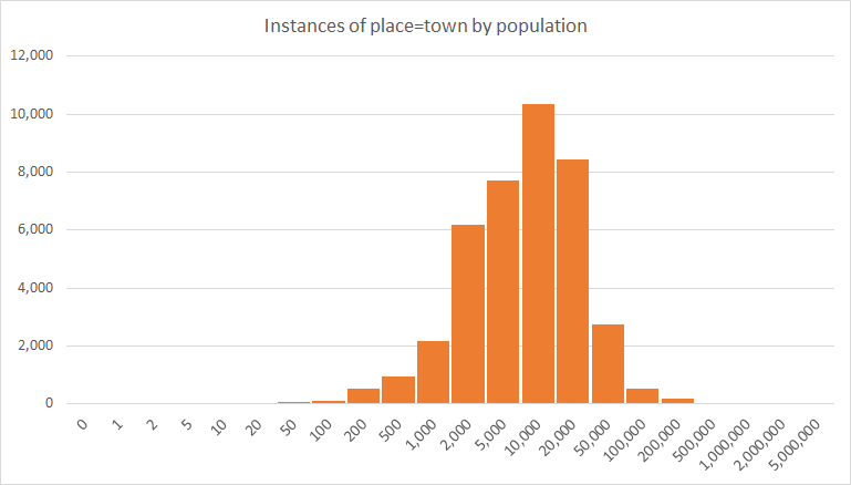
To look at this data logarithmically, I grouped the place nodes logarithmically, in steps of 1, 2, and 5 per 10x jump. When viewing the distribution of place=town, the log-normal shape comes out quite clearly. The number on the X axis represents the upper limit of each bin.
Now that we’ve assessed that the data is distributed log-normally, the next question we want to be able to as is, for a populated place with a certain population, how are the place values distributed? For this, we look across each logarithmic “bin” and determine the percentage of each place value in use:
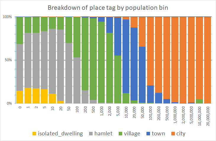
We can assess, for example, that for places with a population between 500 and 1,000 (the bin labeled “1,000”), it’s tagged place=village over 90% of the time. The village blip at 10,000,000 is the result of a data error - a single remote place node being erroneously tagged with a high population in a bin of size n=19. Needless to say, on the far right of this graph, there are fewer and fewer nodes in each bin.
Lastly, we would like to know the mean and standard devation of each place category. However, since this is log normal, we need to compute the mean and standard deviation in the logarithmic domain, and then convert it back. The mean, and plus or minus two standard deviations are computed in the table below:
| place= | -2σ | -1σ | μ | +1σ | +2σ |
|---|---|---|---|---|---|
| city | 8,341 | 33,118 | 131,496 | 522,118 | 2,073,119 |
| town | 782 | 2,814 | 10,124 | 36,422 | 131,039 |
| village | 13 | 71 | 393 | 2,173 | 12,011 |
| hamlet | 2 | 8 | 36 | 165 | 763 |
| isolated_dwelling | 0 | 2 | 6 | 22 | 84 |
Thus, this means that 68% of place=town nodes – one standard deviation – that are tagged with a population tag, have a population= value between 2,814 and 36,422. Taking this out to two standard deviations, 95% of all place=city nodes have a population= tag value between 8,341 and 2,073,119.
Clearly, there is considerable overlap between each category, no doubt because of differences in tagging conventions between places, differences in accounting for population, and differences in place tagging in areas of different population density.
Discussion
Comment from Kai Johnson on 30 April 2024 at 22:31
That’s pretty cool! Thanks for doing the analysis!
Given the scale of the data, the overlap between categories at one standard deviation is remarkably small.
Comment from Zverik on 3 May 2024 at 06:24
Remind me how in 2010 I looked at populated places in Russia and adjusted tagging to make it feel better: https://wiki.openstreetmap.org/wiki/Proposal:Place_In_Russia
Comment from AntMadeira on 12 May 2024 at 17:00
Very interesting analysis. Thank you, ZeLonewolf.
Comment from stevea on 12 May 2024 at 19:43
While I am certainly not your “OSM Professor,” Brian (and you and I together have enjoyed a fair bit of collaboration in this wonderful project), I offer you a solid “A+” on this analysis! Putting things into graphical and statistical terms really helps, since as the saying goes, “a picture (or well-presented graph) tells a thousand words.”
Really nice work and thank you!